Research - (2020) Volume 11, Issue 2
Received: 06-Mar-2020
Published:
15-Apr-2020
, DOI: 10.37421/2155-6180.2020.11.438
Copyright: © 2020 Yue L, et al. This is an open-access article distributed under the terms of the Creative Commons Attribution License, which permits
unrestricted use, distribution, and reproduction in any medium, provided the original author and source are credited.
Our Biometric team was tasked with implementing a primary objective of a newly diagnosed Multiple Myeloma registry to describe practice patterns of common first-line treatment regimens and subsequent therapeutic strategies. This manuscript describes analytical visual methods we used to understand and summarize a complex data structure. We aim to present these methods in a cohesive holistic manner which threads together materials published over time, each with focused narrower objectives, deriving from this primary objective. Methods described in detail elsewhere are briefly revisited here to provide that holistic perspective and to provide details on subsequent variants in newer applications. These have also been used in clinical publications. The coding and graphical display related details corresponding to our Sankey plot clinical publication, for which our methods are unpublished, will also be provided.
Visualization • Programming heuristics • Registries • multiple myeloma • Tepee plots • Sankey plots • Longitudinal state sequence plots
Describing practice patterns in a prospective observational multi-center non-interventional disease registry is particularly difficult to summarize as this observational design allows multiple differing lines of therapy by physician’s choice [1-5]. Further, myeloma is a chronic disease involving multiple progressions requiring retreatment [6]. This has led to various differing strings of treatment for patients in our registry which need to be broken down and classified in meaningful manners before the practice patterns can be classified and described. The next section describes this process.
Business rules to determine lines and regimens
The business rules used in the registry were variants of the guidelines used in a study [7]. The guidelines recommended in Raj Kumar et al. are well suited for clinical trial settings, and similar rules, extant during the enrollment of the first cohort of the registry, were adapted to real world registry settings.
We used the term “line” or “course” to refer to a set of regimens prior to a progression. The first line refers to the course of therapy prior to the first progression. Succeeding lines represent therapeutic courses between progressions.
The first line typically consists of an Induction regimen followed by Maintenance with and without a stem cell transplant (SCT) between induction and maintenance. Figure 1A shows a typical regimen sequence for first line therapy with stem cell transplant. Regimens occurring within a 21-day interval containing pre-transplant conditioning regimens or high dose pre-transplant therapy were coded as transplant regimens. Such sequence diagrams have been helpful to our Biometric team in understanding, and in classificatory coding of regimen sequences in our Multiple Myeloma registry. The sequence strings are illustrative and are not to be interpreted as recommended therapy. We include in our sequence diagrams all common therapies prescribed for Myeloma during the enrollment and follow-up period of our registry. Figure 1B depicts a sequence involving a treatment holiday post-transplant and one involving a tandem transplant in first line. The former occurs less frequently in the second cohort with more recent enrollment (year 2012 to 2016). Tandem transplants do not occur very frequently. Figure 1C depicts a consolidation regimen post-transplant preceding a maintenance regimen. We coded regimens post-transplant as consolidation if they were short (≤60 days) and intensive (Figure 1).
Frail and elderly patients typically are not candidates for SCT. Frailty is often assessed with age (often defined by age > 70) and more formally using criteria such as those in Palumbo [8]. A variant of this criteria is in a study [9]. Figure 1D depicts a regimen sequence in first line for those in-eligible for transplant as well as sequences sometimes seen in our realworld settings, of multiple induction or multiple maintenance regimens. Such multiple strings also occur in the transplant setting. While the norms in the registry, of induction therapy in first line with or without stem cell transplantation or maintenance, are close to that in a clinical trial, we bring out many exceptions in Figures 1A-1D to emphasize the need for the use of complex heuristics to describe patterns in real-world data (Figure 2).
Figure 2 depicts regimen sequences involving multiple lines of therapy. Second line onwards we may not see the induction to maintenance pattern as in first line but a series of lines with a single salvage regimen per line (or multiple salvage regimens in the event of toxicity).

Figure 1. First Line Regimen Sequences.

Figure 2. Regimen Sequence Schema: Depicting Multiple Lines. K - Kyprolis (Carfilzomib);I – Ninlaro (Ixazomib); Pom – Pomalyst (Pomalidomide); Pa – Farydak (Panobinostat); E – Empliciti (Elotuzumab); Do – Doxil (Doxorubicin).
Overview
As noted earlier, the registry’s primary objective has an emphasis on characterizing practice patterns in Myeloma. Other objectives of the registry including descriptive characterizations and outcomes subsequent to various points on this practice pattern pathway (see [10-12] for publication of outcomes post-maintenance), which we have operationalized in various ways over the course of the registry follow-up, derive from these higherlevel objectives. New projects and ideas coming out of these broad objectives and from the study steering committee and clinical and scientific staff continue to drive the development of statistical analysis plans and subsequent analyses.
In Section 2 we had presented communication tools which our Biometric group statisticians and programmers used to understand and explain heuristics for data cave out of practice patterns from this complex registry. We will continue in section 4 with descriptive summaries of these data patterns. The tools we have used to describe practice patterns are Tepee plots for structural tabular data, longitudinal state sequence plots, and Sankey plots. The methods for Tepee plots and the longitudinal sequence plots are described elsewhere [2,13,14] and will be addressed briefly with some descriptions of these in newer subsequent applications, and additionally those tools will used to build up to the description of the Sankey plots. Methods pertaining to this last tool will be described in greater detail.
Myeloma patients tend to have long exposure to first line therapy followed by a relatively rapid sequence of salvage therapies. In Jagannath et al. [15] we note median time to first progression in Myeloma of 30.8 months and subsequent time to successive progressions ranging from 7.5 months to 3.5 months. Hence practice patterns in first line are of strong interest – particularly induction and maintenance therapy in transplant and nontransplant settings. We summarize these regimens and regimens initiating in second line in Section 4.1 using a static tool called a Tepee Plot [2,16]. A more dynamic tool to display patterns over time is in Section 4.3 on Sankey Plots. A similar tool which is more informative about duration of therapy is described in Section 4.2 on Longitudinal State Transition Graphics.
Tepee plots for structured tabular data
A Tepee Plot visualizes data tables in rows and columns with meaningful ordering, especially in the rows. We used this tool with data in our registry to depict treatment patterns in first and second lines to support clinical publications [4,16]. Hence, we provide treatment and treatment class deidentified versions of some of the graphics in the clinical publications, to support the description of the heuristics used to construct the graphic.
Essential details in the heuristics
We start with a data table, denoted by L, consisting of element lkj which represent the data of interest by the kth column (representing an attribute such as therapy as in Figure 6) at the jth level (representing bi-annual periods for instance as in Figure 6). The subscript k for the columns from the left to the right of the matrix varies from 1 to the first attribute to the last or nth attribute in some appropriate pre-selected order. Ordering can be adjusted to improve the display. The subscript for the levels (rows) from the bottom to the top of the matrix varies from 0 for the bottom most in the hierarchy to some highest level . We then obtain a matrix C of coordinates with elements
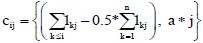
Where a is some appropriate amount by which we would like the hierarchical levels in the Tepee to be separated. A comma separates the x co-ordinate from the y co-ordinate. The subscript for the columns from left to right of the matrix C varies from 0 to n and represents the n+1 boundaries which will separate the colors of the Tepee. The subscript for the rows from bottom to top of the matrix C varies as before from 0 for the bottom most to the highest level m.
Figure 6 was used to depict common maintenance regimens in first line post-transplant in a study [17]. This publication also presented induction regimens over the enrollment time frame of the registry in transplant and non-transplant eligible settings, maintenance in the non-transplant setting, and second line starting regimens. The legend in Figure 6 has been permuted randomly to de-identify the data. The grey strip to the right of the graphic is not permuted and continues to represent “all other” regimens. The total length of each horizontal line represents 100% of the patients enrolled in that period. The colored line segment represents the percent of patients with the regimen (permuted here) associated with that color as in the legend. The Induction regimen (first regimen post-diagnosis) tepee plots for those likely to get transplant (age < 70 years), in Figure 3A, use date of first dose to determine periods. Figure 3B looks at regimens initiating in second line. In the US context, which does not restrict physician choice of therapies combining approved agents, there can be regimens combining therapies in uncommon manners. The ‘other’ grey strip, with these other regimens, was much wider in the second line setting (Figure 3).
Figure 4A (data de-identified by randomly permutation) depicts the wide range of the ‘other’ combination regimens used in Figure 3B. In Jagannath et al. [4] we saw that despite appearance to the contrary, the regimens used in second line fall within clinically reasonable patterns when grouped by Myeloma drug categories such as Proteasome inhibitors, Immunomodulatory drugs, steroids, Alkylators and anti-CD38 drugs or combinations of these. Figure 4B, where these drug classes are masked, show that the combinations B, C, and D (see [4] for a decode) were used in second line 70% to 80% of the time during the 2010 to 2016 period in the MM-Connect Registry. We will follow through with these drug classes in the next section on longitudinal state transition graphics and in Section 4.3 on Sankey Plots (Figure 4).

Figure 3. Common First and Second Line Regimens Over the Course of the Registry.

Figure 4. Regimens in the Second Line Setting.
Longitudinal state transition graphics
We continue with the masked drug classes as in Figure 7 to look at transitions between drug classes in first line, and the subsequent postfirst progression disease, post-second progression disease, and death states. We construct graphics depicting this using tool for state transition graphics in Gabadinho et al. [18,19] and the edge clustering heuristic in a study [3]. We use the R package TraMineR to map a subject’s states to colors and represent each subject’s transition as a colored string over time. We will follow Myeloma patients in our registry who have had stem cell transplantation. Each subject’s string consists of a starting state and a state every month for 5 years from the start of the first therapy for each treated subject in Cohort 1. For GAPs less than 3 months, we stretch prior regimens forward through half of the GAP and stretch post-GAP regimens backward through half of the GAP. We stretch the last regimen or GAP before discontinuation through to the discontinuation date, stretch the discontinuation state to the progression disease (PD) or death date if there is a PD or death after discontinuation, stretch any first or second PD to the end of the 5-year period or to a death state, and stretch the death state to the end of the 5-year period. The unordered subject strings stacked on each other are in Figure 5A. An interesting feature in the context of stem cell transplantation is a treatment free period (which we call a GAP in Figure 5A) post-transplant. Most transplants in Multiple Myeloma occur between about cycle 3 to cycle 8. The blue patch starting at about cycle 3 (C3) and extending to about cycle 8 (C8) reflects, even in the unordered data, a period without therapy after stem cell transplantation.

Figure 5. A Longitudinal State Graph, Unordered Subject Strings to Left and Ordered to Right.
Other states after start of first therapy in first line, other than GAP, include drug class B, C and D and all other drug classes in first line, discontinuation, post-first-PD (PD1), post-second-PD (PD2) and death. In this and the Sankey tool short term regimens associated with transplant we considered procedures and not plotted. However, transplantation was brought in through separate displays for transplant and non-transplant context. We calculate similarity measures between subject strings by combing ordinal and nominal measures of similarity between the strings. For the states before PD, we use the nominal Hamming similarity measure and the Euclidian similarity measure for the states “before PD”, “Discontinuation”, “Post-First PD”, “Post-Second PD” and “Death”, coded from 1 to 5. Note that similarity measures can easily be computed from distance measures and vice-versa [3]. The Hamming measure (h) computes as a similarity measure and the Euclidean measure (e) is usually computed as a distance measure and we convert it to a similarity measure. We computed a composite measure of similarity of two subject strings using weights, wh and we as:
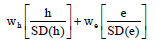
In our context, weight of 0.4 and 0.6 respectively produced the best visualization of the transitions. Details on the methods and an R function doing the ordering (edge clustering) is in a study [4] (Figure 5).
Once the subject strings are ordered using the edge clustering function, they were stacked using the TraMineR R package to produce Figure 5B. The Code computing the similarity measure and obtaining the visualization is provided in supplementary materials in longitudinal.txt (Appendix A). The ordering brings out additional patterns before and after the treatment free interval. Some have a short (less than 3 months) treatment free period after transplant and our heuristic imputes continuous therapies. Some subjects are treatment free post-transplant for long periods, possibly due to good response on transplant alone. Many are progression free on posttransplant maintenance therapy. The left-hand edge at 5 years (dark red) reflects a little less than a 50% mortality, consistent with median survival of 68.3 months (5.69 years) reported during the time-frame of this registry [15]. This visualization provides a good assessment of duration in the various states unlike the Tepee graphics in Section 4.1 or the Sankey plots that are described in the next section.
Sankey plots
As with the longitudinal graphic we consider the transplant setting and classify regimens as those in Drug Classes B, C, D, Others and Gaps (treatment holidays). The Sankey nodes have regimens at the start of line 1, through the post-transplant regimen in line 1, the start of lines 2 and 3 and end at the start of line 4. Terminating states from the regimen groups end as ongoing, death or discontinuation. Note that the last regimen in first line can contain ongoing induction when it leads immediately to one of the terminating states.
Figure 6 shows the final Sankey plot for the drug classes, nodes and terminating states described above. Sankey plots for the non-transplant context and an animated version along with the drug class decode and a full clinical interpretation are in a study [5]. Additional statistics pertaining to each flow and a video animation are also available in this publication at Clinical Lymphoma Myeloma Leukemia. Here we provide methodological details for the construction of the Sankey plot.
To understand the structure of the plot, consider for instance the node at the start of second line. At this node there are 8 groups or states. There are four therapy groups, those with a treatment-free interval at the start of second line, two terminating states not emanating flow, and those ongoing on the previous line. The former 5 states emanate flows to the same 8 states at the next node (start of third line) leading to a total of 5X8=40 flows (Figure 6).

Figure 6. Sankey Plot for Treatment Sequencing in SCT Patients.
The creation of the plot takes a data format like the partial data shown in Table 1. The second column contains labels for the starting states at each node. The first column provides a Label ID, according to which order the nodes will be displayed. The first four Label ID’s from 0 to 3 correspond to the labels for the states at the first nodes. Label ID’s from 4 to 8 corresponds to states at the second nodes. The third column has the color of the displayed state/group label at the node. The content in the columns lshow, s, t, v and c help in configuring the links or flows between states across nodes. The column s identifies the starting Label ID identifying the starting state and node. The column t identifies the ending Label ID of the flow identifying the ending state and node of the flow. The thickness of this flow is proportional to the number of patients having this transition and this is provided by the column v. The column c representing the color of flows identifying states. The co-ordinates nnumx, nnumy and align provide the positioning of the annotation and alignments. The nnumt provides the frequency and percent of patients in a group at each node. Column acolor and bgcolor defines the color of this numeric content and its background respectively. The nshow and nhide show the start time and the end time in seconds of the display of the state information at the nodes in the animation version. The descriptive statistics on the states at the first node, for instance, is retained through the course of the animation but that for the second node disappears at the 12th second, in order to de-clutter the display, as statistics for the third node appear. Column sct, sct.show, sctp, sctp.show and sctp.hide define the display of SCT Line.
| lid | label | lcolor | lshow | s | t | v | c | nnumx | nnumy | nnumt | acolor | bgclor | align | nshow | nhide | sct | sct.show | sctp | sctp.show | sctp.hide |
|---|---|---|---|---|---|---|---|---|---|---|---|---|---|---|---|---|---|---|---|---|
| 0 | Class B | black | 1 | 0 | 4 | 36 | rgba (159, 199, 224,0.8) | 0 | 0.83 | <b>n=87, 8%</b> | black | rgba(0, 0,0,0) | left | 1 | 20 | 0.25 | 2 | M 0.085,0.68 C 0.32,0.73 0.5,0.75 0.8778,0.74 | 85 | 86 |
| 1 | Class D | black | 1 | 0 | 5 | 2 | rgba(159, 199, 224,0.8) | 0 | 0.59 | <b>n=502, 49%</b> | black | rgba(0, 0,0,0) | left | 1 | 20 | |||||
| 2 | Other | black | 1 | 0 | 6 | 35 | rgba(159, 199, 224,0.8) | 0 | 0.41 | <b> n=10, 1%</b> | black | rgba(0, 0,0,0) | left | 1 | 20 | |||||
| 3 | Class C | black | 1 | 0 | 7 | 9 | rgba(159, 199, 224,0.8) | 0 | 0.235 | <b>n=435, 42%</b> | black | rgba(0, 0,0,0) | left | 1 | 20 | |||||
| 4 | Class B | black | 1 | 0 | 8 | 5 | rgba(159, 199, 224,0.8) | 0.24 | 0.893 | <b>SCT</b> | black | rgba(0, 0,0,0) | center | 2 | 20 | |||||
| 5 | Class D | black | 1 | 4 | 9 | 9 | rgba(159, 199, 224,0.8) | 0.175 | 0.876 | (p25=4.4mo., p75=7.2mo.) | black | rgba(0, 0,0,0) | center | 2 | 20 | |||||
| 6 | No maintenance | black | 1 | 4 | 10 | 11 | rgba(159, 199, 224,0.8) | 0.25 | 0.05 | <b>Median 1st PFS <br> 47.4 months</b> | black | rgba(0, 0,0,0) | center | 1 | 20 | |||||
| 7 | Other | black | 1 | 4 | 11 | 6 | rgba(159, 199, 224,0.8) | 0.56 | 0.05 | <b>Median 2nd PFS <br> 10.5 months</b> | black | rgba(0, 0,0,0) | center | 1 | 20 | |||||
| 8 | Class C | black | 1 | 4 | 12 | 1 | rgba(159, 199, 224,0.8) | 0.8 | 0.05 | <b>Median 3rd PFS<br> 6.3 months</b> | black | rgba(0, 0,0,0) | center | 1 | 20 |
The information in the format in Table 1 is used in the following technical solution.
Technical solution for Sankey plot
To generate the Sankey Plot, we start by setting up the fraction of the range of the Sankey diagram to that for the entire plot and add the nodes, links, annotations and customized shapes. Then we use JavaScript to finalize layout and enable the customized animation through inserting JavaScript into htmlwidgets (version 1.2). JQuery-1.11.3 was used to achieve functions in JavaScript including layout adjustment, therapy flow animation and corresponding fade in annotations.
We set up the fraction of range for Sankey using the following code:
Type="sankey",
Orientation="h",
Domain=list(x=list(0.1,0.9),y=list(0.1,0.9))
The nodes, links, annotations and customized shapes were added using the following:
Node=list(label=~label, color=~lcolor, pad=5, thickness=5,
line=list(color= alpha("#FFFFFF", 0.0), width=0.5))
Link=list(source=~s,target=~t,value=~v,color=~c)
add_annotations(x=row$nnumx,y=row$nnumy,text=row$nnumt,align=r
ow$align, showarrow=F, bgcolor=row$bgclor)
layout_shapes<-list()
R Code to generate Sankey Plot and insert JavaScript into htmlwidgets is provided in supplementary materials as Sankey.txt (Appendix B). The JavaScript to adjust layout and enable animation is provided in supplementary materials as javascript_sample.txt (Appendix C). Finally, the JavaScript can be inserted into htmlwidgets at the R using
javascript <- htmltools::HTML(readChar(jsFileName, file.info(jsFileName)$size)) p <- htmlwidgets::prependContent(p, htmlwidgets::onStaticRenderCom plete(javascript))
htmlwidgets::saveWidget(p, outf, selfcontained=F) (Table 1).
A disease registry as opposed to a drug registry can allow for the collection of a latitude of therapies used in standard of care across community, academic and government health facilities. Such observational collections of data can yield a complex branching through therapeutic options as patients are re-treated at diagnosis, through first line and after subsequent relapses. We have described here, the means through which our biometric team worked through this complexity in the context of a registry enrolling newly diagnosed Multiple Myeloma patients. We used sequence diagrams to communicate variations in treatment patterns from standards in clinical trials, within our team and with project team members, to develop robust heuristics accounting for exceptions. These have helped in creating data carve-outs for projects looking at patient characteristic groups and/or therapeutic options at Induction, First Line Maintenance post-transplant or after relapse on efficacy, safety and quality of life [10-14].
Evaluating the treatment patterns in first line and subsequent lines were themselves one of the primary objectives of the registry. The manuscript describes three analytical visual methods used to describe these patterns. The Tepee plot helped us assess the stability or change in the percent initiating various regimens over bi-annual periods over the course of enrollment and follow-up of the registry. The longitudinal state transition graphics provides a static tool to assess transitions between therapy and disease states as well as durations in these states. This tool has been presented in other contexts [20,21]. The heuristics for an animation of the flow of patients between therapies from first line to fourth line using the Sankey plot are described as well. The video animation is available at Clinical Lymphoma Myeloma Leukemia [5].
Consort diagrams summarizing data carve-outs from registries, electronic health records, patient chart extracts and other observational sources often do not adequately reflect the underlying data complexity. Our tools provide a means for understanding and communicating complex therapeutic patterns and allow subsequent study of patient outcomes at various junctures in the Myeloma patient’s treatment pathway.
Journal of Biometrics & Biostatistics received 3496 citations as per Google Scholar report